Travel & History learning app
Time Traveler|Explore Culture Through Every Journey


The challenge of creating seamless exploration
70%
of travelers prefer AI tools to simplify itinerary planning
83%
value cultural and historical insights from AI guides
25%
report time-saving benefits from AI-assisted planning
These insights highlight a clear demand for smarter, more meaningful travel tools. Time Traveler was designed to meet this need—combining AI-powered itinerary planning with rich historical and cultural storytelling in one seamless experience.


Meet Jessie:|A curious traveler with limited time
Jessie, is a restaurant manager based in San Francisco. With a demanding work schedule, she only has time for one extended trip each year. She dreams of exploring the world and learning about different cultures, but the overwhelming planning process and scattered information often leave her frustrated. Because of this, she frequently misses out on the historical and cultural depth she values most in her travels.

Time Traveler|Your Personal AI Guide
I created Time Traveler to bridge the gap between travel planning and cultural discovery. By offering intuitive, AI-powered tools, the app helps users explore the deeper stories behind every destination—seamlessly, meaningfully, and without the overwhelm.

Key User Pain Points
Through user interviews and surveys, we identified three core challenges:
Fragmented Information
Travelers struggle to find details across scattered websites and apps.
Lack of Cultural Depth
Most tools miss the meaningful stories behind each destination.
Complex Planning
Manually organizing itineraries is time-consuming and discouraging..
Our Solution|Core Features of Time Traveler
Three core features support deeper cultural connection and exploration throughout the travel experience:


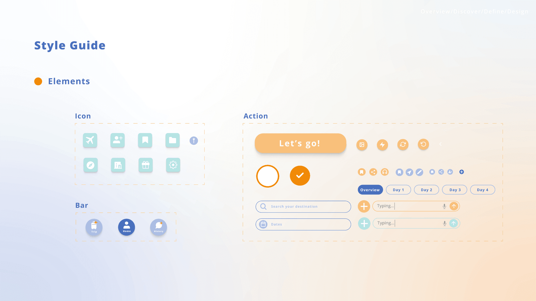
Design Direction|A Color System for Context
I implemented a three-color palette to distinguish the app’s core features, creating a visual system that enhances usability and supports intuitive navigation. Each color evokes a different mood, helping users instantly recognize the type of content they’re accessing—planning, history, or cultural discovery.
Purple – Trip Planner
Conveys clarity and control, helping users plan efficiently with confidence.
Turquoise – History Chat
Reduces the gap between users and historical content through a relaxed tone.
Orange – History Lens
Evokes energy and revival, enhancing engagement in cultural discovery.

Improving Usability Through User Feedback
Through multiple rounds of testing, I gathered valuable user feedback that shaped final design decisions. Below are two key examples:
01|Icon Confusion: Misinterpretation of the History Feature
The original book icon gave users the impression of static reference material rather than an interactive AI assistant. This confusion lowered both discovery and engagement with the feature.
◦ Design Adjustment
Replaced the icon with a chat bubble + AI star symbol to clearly signal interactivity and intelligent support. Also applied this icon style to the AI Trip Planner for visual consistency and better recognition across the interface.


02|Fragmented Features Confuse User Navigation◦ Insight
The separation of history and culture features into different entry points confused users, making it unclear when to use which function and increasing cognitive load.
◦ Design Adjustment
Merged both features into a single “AI History Chat” interface, allowing users to ask real-time questions about either topic in one place. This consolidation reduced unnecessary toggling and streamlined the user flow for a smoother, more intuitive experience.


Final Prototype
What I learned…?
Through the Time Traveler Project, I learned the importance of user-centered design in balancing efficiency and cultural exploration for busy travelers. Simplifying trip planning improves user adoption by making the process effortless and reducing frustration. Iterating based on feedback allowed me to refine the user flow, creating a smoother, more intuitive experience.
